Unlock the world of data visualization with my beginner’s guide to ggplot in Python. If you’ve ever wanted to create stunning and informative graphs, charts, and plots effortlessly, this is where you begin your journey.
In this article, we’ll take you through the fundamental concepts of ggplot, a powerful data visualization library, and show you how to harness its capabilities to transform your data into compelling visual narratives.
Whether you’re a newcomer to Python or a seasoned programmer looking to dive into the world of data visualization, this guide will equip you with the knowledge and skills to create impactful visualizations with ease.
The basic structure of a ggplot consists of several components:
- Data: The data that you want to visualize.
- Aesthetic mapping: This specifies how variables in the data should be mapped to visual properties of the plot, such as the x and y axes, colour, shape, and size.
- Geometric objects: These are the visual elements that represent the data, such as points, lines, bars, and polygons.
- Scales: These control how the data is represented on the axes, such as the range of values and the labelling of tick marks.
- Facets: These allow you to create multiple plots based on subsets of the data, such as creating separate plots for different groups or categories.
To create a ggplot, you start by specifying the data and aesthetic mapping using the ggplot() function, and then add layers of geometric objects, scales, and facets using various functions such as geom_point(), scale_x_continuous(), and facet_wrap(). The resulting plot can be customized in many ways using various arguments and options.
Overall, ggplot is a powerful tool for data visualization that allows users to create high-quality, customizable plots that can help to reveal insights and patterns in their data.
Installation
Plotnine can be installed using pip, a package manager for Python.
!pip install plotnine
Importing Libraries:
Importing Data:
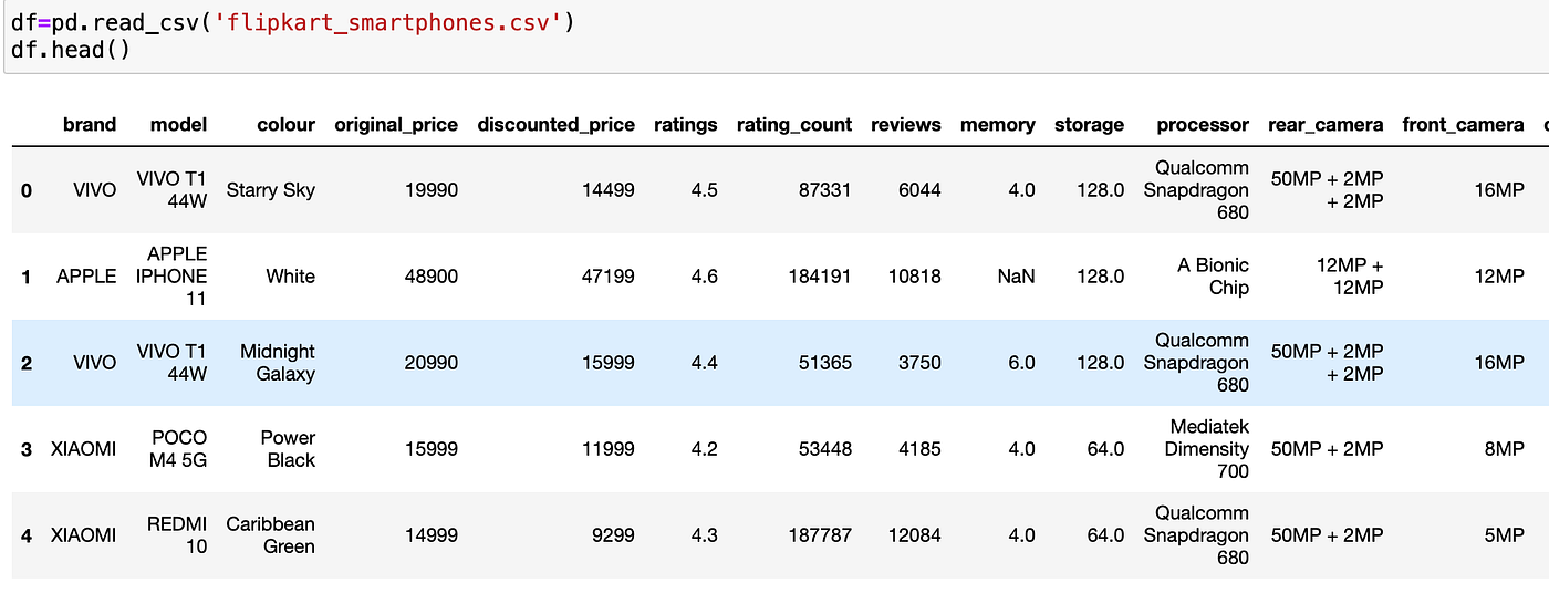
Let’s start creating visualisations, For that I am importing flipkart_smartphones dataset.
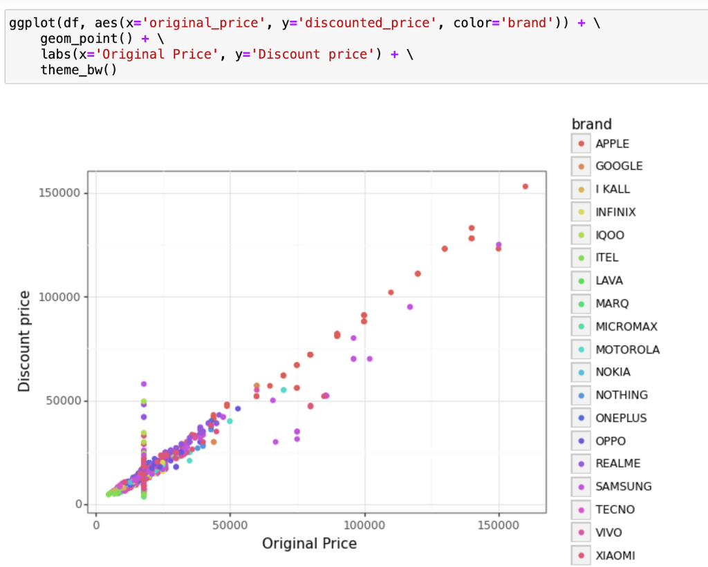
Scatter plot to show the relationship between ratings and discounted price using ggplot

This code creates a scatter plot using ggplot function of plotnine package. The plot displays the relationship between original_price and discounted_price variables, coloured by brand.
Here’s a breakdown of the code:
ggplot(df, aes(x='original_price', y='discounted_price', color='brand')): Theggplotfunction initializes a new plot object, which is then customized with subsequent layers. Theaesfunction maps variables to visual aesthetics. Here,original_priceis mapped to the x-axis,discounted_priceis mapped to the y-axis, andbrandis mapped to colour.geom_point(): This layer adds points to the plot. Each point represents a device.labs(x='Original Price', y='Discount price'): This function sets the x-axis and y-axis labels.theme_bw(): This function sets the theme of the plot to a simple black-and-white scheme.
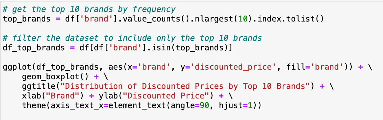
Box plot to show distribution of discounted prices by brand:
Output:
This code creates a boxplot visualization to show the distribution of discounted prices for the top 10 brands in the dataset.
the ggplot function is called to create the plot. The aes function is used to map the brand variable to the x-axis and the discounted_price variable to the y-axis, and the fill argument is set to brand to fill the boxes with colours corresponding to each brand.
The geom_boxplot function is called to create the boxplot. The ggtitle, xlab, and ylab functions are used to add a title and labels to the plot.
Finally, the theme function is used to adjust the x-axis text to be vertical and aligned to the right.
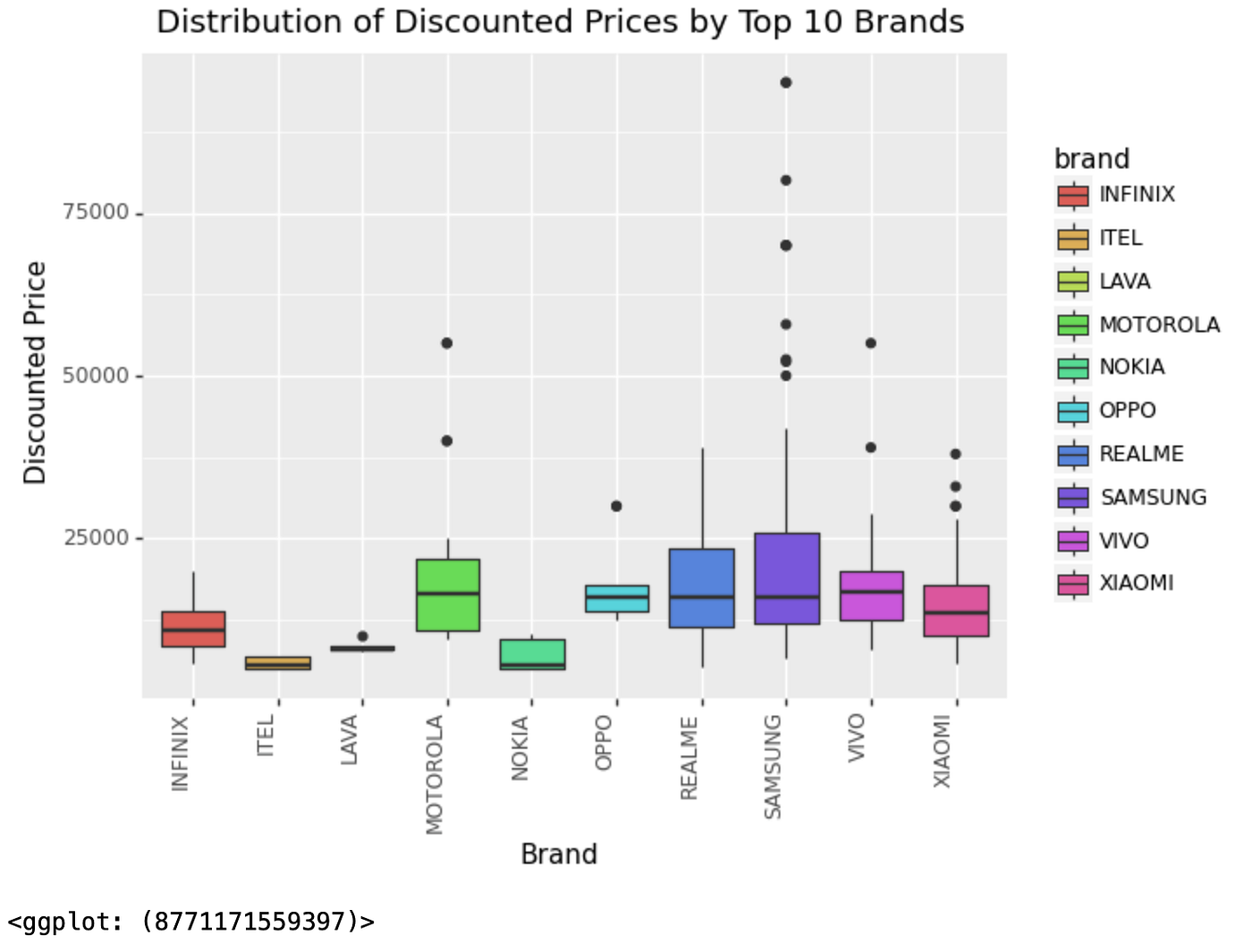
Histogram to show the distribution of discounted prices:
This code creates a histogram of the distribution of discounted prices in the dataframe df. The histogram bins are set to a width of 5000 using binwidth=5000. The histogram bars are filled with blue color and have white borders using color='white', fill='blue'. The transparency of the bars is set to 0.5 using alpha=0.5.
The plot is given a title using ggtitle("Distribution of Discounted Prices") and the x and y axes are labeled using xlab("Discounted Price") and ylab("Count"). The aes() function is used to specify that the histogram should be plotted using the discounted_price column.
To compare the distribution of Original Prices and Discounted prices across different battery types. We can use the facet option to create separate plots for each battery type.
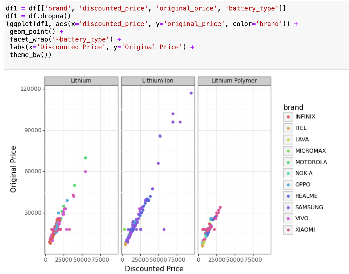
This code creates a scatter plot with discounted price on the x-axis and the original price on the y-axis, with the points coloured by brand. It also uses the facet_wrap function to create separate plots for each level of the battery_type variable.
(ggplot(df1, aes(x='discounted_price', y='original_price', color='brand'))starts the plot, setting the x-axis todiscounted_price, the y-axis tooriginal_price, and the colour of the points based onbrand.geom_point()adds the points to the plot.facet_wrap('~battery_type')creates separate plots for each level ofbattery_type.labs(x='Discounted Price', y='Original Price')adds axis labels to the plot.theme_bw()sets a black-and-white theme for the plot.
Conclusion:
In this article, We have explored the capabilities of ggplot, a Python library for data visualization. We have seen how to create interactive visualizations using geometric shapes, aesthetics, and statistical transformations. We have also explored the facet option, which allows us to create subplots that display different subsets of the data.
By using the ggplot library, analysts can create highly customizable and interactive visualizations that can help them to better understand their data and communicate insights to others.